


sizes=“auto” on Images
sizes="auto" lets the browser calculate the rendered size of a lazy-loaded image itself — no manual sizes attribute required. It removes one of the most error-prone parts of responsive images.
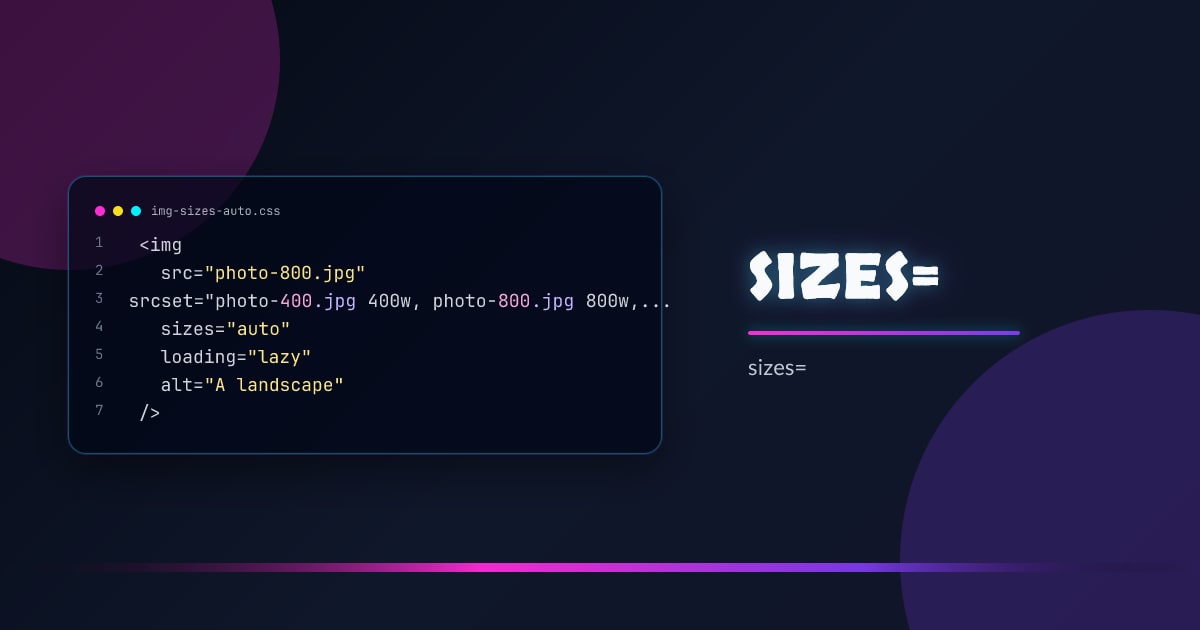
<img
  src="photo-800.jpg"
  srcset="photo-400.jpg 400w, photo-800.jpg 800w, photo-1600.jpg 1600w"
  sizes="auto"
  loading="lazy"
  alt="A landscape"
/>
The browser measures the image’s layout size after the first paint and uses that to pick the right srcset candidate on subsequent loads.
How It Works
With sizes="auto", the browser defers resource selection until it knows the image’s rendered width. For lazy images this is fine — they haven’t been fetched yet. The browser:
- Lays out the page
- Measures the image’s
clientWidth - Picks the best
srcsetcandidate for that width - Fetches it
This is only valid on loading="lazy" images. Eager images need an explicit sizes value because they’re fetched before layout completes.
Why Manual sizes Is Hard
The classic approach requires you to predict the rendered width at every breakpoint:
<!-- Manual: fragile, must stay in sync with CSS -->
<img
  srcset="photo-400.jpg 400w, photo-800.jpg 800w"
  sizes="(min-width: 1024px) 800px, (min-width: 600px) calc(100vw - 2rem), 100vw"
  src="photo-800.jpg"
  alt=""
/>
Any time the layout changes, this string goes stale. sizes="auto" eliminates the maintenance burden entirely.
Combining with width and height
Always include width and height attributes to prevent layout shift. The browser uses these for aspect-ratio reservation before the image loads:
<img
  srcset="photo-400.jpg 400w, photo-800.jpg 800w, photo-1600.jpg 1600w"
  sizes="auto"
  loading="lazy"
  width="800"
  height="600"
  alt="A landscape"
/>
With picture and art direction
sizes="auto" works on the <img> inside a <picture> element, though <source> elements still need explicit sizes if they use srcset with width descriptors:
<picture>
  <source
    media="(min-width: 800px)"
    srcset="wide-800.jpg 800w, wide-1600.jpg 1600w"
    sizes="(min-width: 1200px) 800px, 100vw"
  />
  <img
    srcset="square-400.jpg 400w, square-800.jpg 800w"
    sizes="auto"
    loading="lazy"
    width="400"
    height="400"
    alt=""
  />
</picture>
Browser Support
sizes="auto" shipped in Chrome 109, Firefox 126, and Safari 17.5. All evergreen browsers support it. Use it on any new loading="lazy" image — it’s safe to ship today.
// Detect support (optional — graceful degradation handles unsupported browsers)
const img = document.createElement("img");
const supported = img.sizes === "" || "auto" in img;
Browsers that don’t understand sizes="auto" treat it as an unknown value and fall back to 100vw — they still work, just without the optimized selection.
Browser support snapshot
Live support matrix for mdn-html_elements_img_sizes_auto from
Can I Use.
Show static fallback image

Source: caniuse.com


