


Multi-Column Wrap and Height Properties
CSS multi-column layout got a long-overdue set of properties for controlling how columns wrap and how tall they grow. column-wrap, column-height, and related properties give you the fine-grained control that was previously only possible with JavaScript.
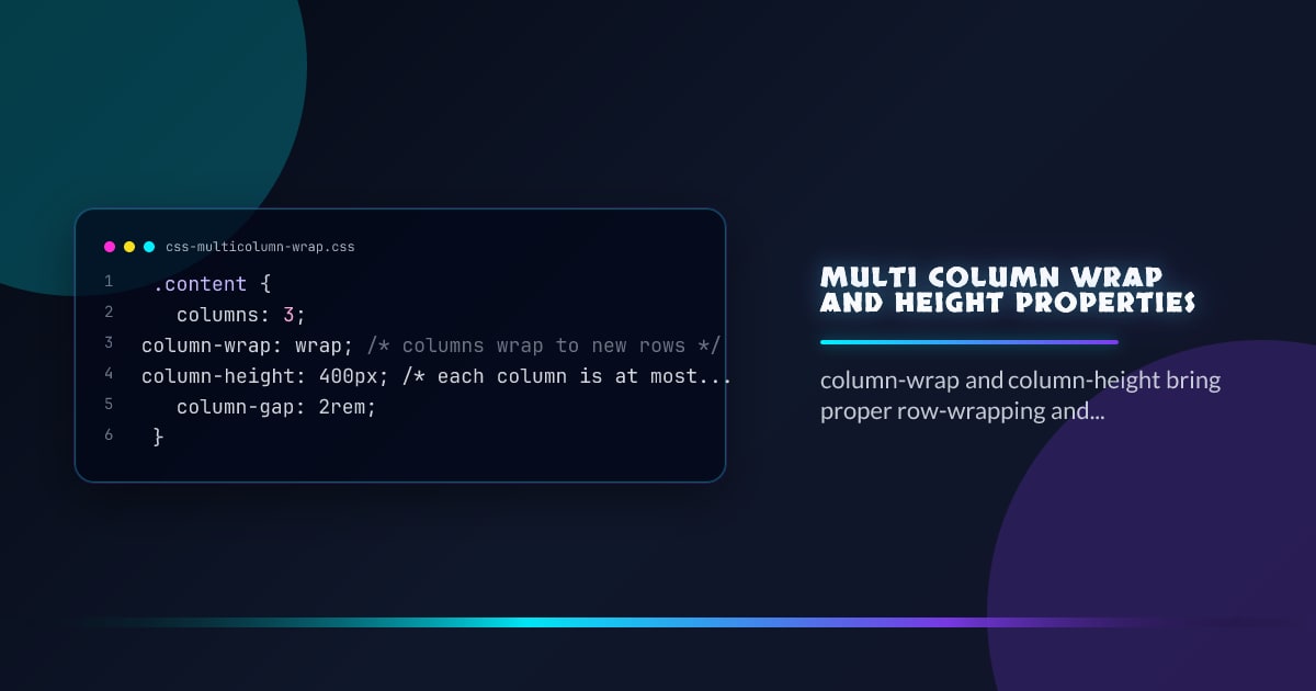
.content {
  columns: 3;
  column-wrap: wrap; /* columns wrap to new rows */
  column-height: 400px; /* each column is at most 400px tall */
  column-gap: 2rem;
}
column-wrap
By default, multi-column layout squishes everything into a single row of columns. column-wrap: wrap lets the column set break into multiple rows when content overflows the column height:
.flow {
  columns: 3;
  column-wrap: nowrap; /* default — all columns in one row */
}

.flow {
  columns: 3;
  column-height: 300px;
  column-wrap: wrap; /* columns wrap into rows after 300px */
}
Think of it as flex-wrap but for column tracks.
column-height
Sets an explicit height limit per column. Content taller than this value causes the column set to wrap (when column-wrap: wrap is set) or overflow:
.magazine {
  columns: 2;
  column-height: 60vh;
  column-wrap: wrap;
  column-gap: 1.5rem;
}
This is the key to proper paginated or magazine-style layouts entirely in CSS.
column-rule
The existing column-rule shorthand draws dividers between columns, and now works correctly across wrapped column rows:
.content {
  columns: 3;
  column-height: 400px;
  column-wrap: wrap;
  column-rule: 1px solid oklch(80% 0 0);
}
Balancing Columns
column-fill controls how content is distributed across columns:
/* Default — balance content across all columns */
.balanced {
  column-fill: balance;
}

/* Fill columns sequentially — first fills before moving to the next */
.sequential {
  column-fill: auto;
}

/* Balance only the last row */
.balanced-last {
  column-fill: balance-all;
}
balance is useful for short content; auto is better for long scrollable content where you want the left column filled first.
Spanning Elements
Elements can span all columns with column-span: all, which works across wrapped rows:
.pull-quote {
  column-span: all;
  text-align: center;
  font-size: 1.5rem;
  padding-block: 2rem;
  border-block: 1px solid currentColor;
}
Avoiding Column Breaks Inside Elements
/* Never break a figure across columns */
figure {
  break-inside: avoid;
}

/* Always start a new column before h2 */
h2 {
  break-before: column;
}
Practical Newspaper Layout
.article {
  columns: 3;
  column-height: 70vh;
  column-wrap: wrap;
  column-gap: 2rem;
  column-rule: 1px solid oklch(85% 0 0);
}

.article h2 {
  break-before: column;
}
.article figure {
  break-inside: avoid;
}
.article .lede {
  column-span: all;
  font-size: 1.25rem;
}
Browser support snapshot
Live support matrix for multicolumn from
Can I Use.
Show static fallback image

Source: caniuse.com


