


CSS Masonry — CSS Grid Lanes
Native CSS masonry is shipping via grid-template-rows: masonry (or the masonry shorthand). No JavaScript layout engine, no ResizeObserver polling — the browser handles it.
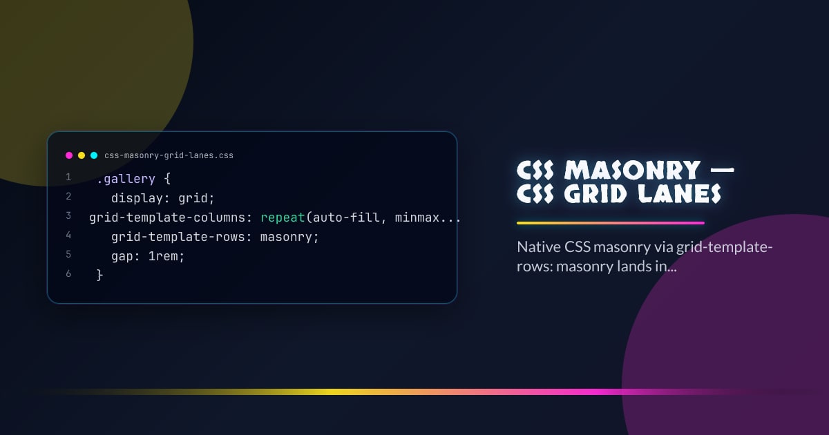
.gallery {
  display: grid;
  grid-template-columns: repeat(auto-fill, minmax(280px, 1fr));
  grid-template-rows: masonry;
  gap: 1rem;
}
Items pack into the shortest column automatically, exactly like Pinterest-style layouts but without a dependency.
Syntax
Two properties control masonry behavior:
/* Masonry on the block (vertical) axis */
.grid {
  display: grid;
  grid-template-columns: repeat(3, 1fr);
  grid-template-rows: masonry;
}

/* Masonry on the inline (horizontal) axis */
.grid {
  display: grid;
  grid-template-rows: repeat(3, auto);
  grid-template-columns: masonry;
}
The non-masonry axis still uses normal grid tracks. Items span, align, and place as usual on that axis.
masonry-slack
Controls how closely items pack. Higher values allow more deviation from the shortest track:
.gallery {
  display: grid;
  grid-template-columns: repeat(4, 1fr);
  grid-template-rows: masonry;
  masonry-slack: 1rem; /* default is 0 */
}
A small masonry-slack value permits slight height variation in exchange for a more aesthetically balanced layout.
masonry-template-tracks and masonry-template-areas
Name the masonry tracks for precise placement:
.layout {
  display: grid;
  grid-template-columns: [sidebar] 240px [main] 1fr [aside] 240px;
  grid-template-rows: masonry;
}

.sidebar {
  grid-column: sidebar;
}
.featured {
  grid-column: main / span 2;
}
Alignment and Spanning
Grid alignment properties work on the non-masonry axis. Spanning multiple columns is fully supported:
.wide-item {
  grid-column: span 2;
}

.gallery {
  align-tracks: stretch; /* or start | end | center */
  justify-tracks: stretch;
}
Feature Detection
@supports (grid-template-rows: masonry) {
  .gallery {
    grid-template-rows: masonry;
  }
}
const supported = CSS.supports("grid-template-rows", "masonry");Fall back to a normal auto-row grid or a JS masonry library when unsupported.
Interop 2026
Masonry was added to the Interop 2026 focus areas. Chrome, Safari, and Firefox have all shipped implementations — check @supports before removing JS-based fallbacks in production.
.gallery {
  /* JS masonry baseline */
  column-count: 3;
  column-gap: 1rem;
}

@supports (grid-template-rows: masonry) {
  .gallery {
    column-count: unset;
    display: grid;
    grid-template-columns: repeat(3, 1fr);
    grid-template-rows: masonry;
    gap: 1rem;
  }
}
Browser support snapshot
Live support matrix for css-grid from
Can I Use.
Show static fallback image

Source: caniuse.com


