


CSS border-image
border-image replaces a box’s standard border with a sliced image or gradient. It’s one of the most underused CSS properties for creating rich decorative borders without any extra DOM elements.
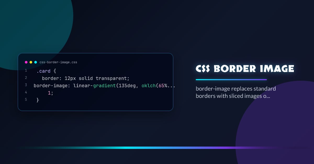
.card {
  border: 12px solid transparent;
  border-image: linear-gradient(135deg, oklch(65% 0.2 250), oklch(65% 0.2 145))
    1;
}
This gives you a gradient border — something border-color can’t do.
The border-image Shorthand
border-image: <source> <slice> / <width> / <outset> <repeat>;All parts except <source> are optional:
/* Gradient border, 1px slice, stretched */
border-image: linear-gradient(to right, red, blue) 1;

/* Image border with 30px slices, repeated tiles */
border-image: url("border.png") 30 round;

/* Full control */
border-image: url("frame.png") 40 / 20px / 5px round stretch;
border-image-slice
The slice value cuts the source image into 9 regions (like a 9-patch): four corners, four edges, and a center:
border-image-source: url("frame.png");
border-image-slice: 30; /* 30px from each edge */
border-image-slice: 10% 20%; /* 10% top/bottom, 20% left/right */
border-image-slice: 30 fill; /* fill keyword includes the center */
The fill keyword renders the center region inside the element — useful for image frames.
Gradient Borders
Any CSS gradient works as a border-image source:
/* Conic gradient border */
.fancy {
  border: 4px solid transparent;
  border-image: conic-gradient(
      oklch(65% 0.2 0),
      oklch(65% 0.2 90),
      oklch(65% 0.2 180),
      oklch(65% 0.2 270),
      oklch(65% 0.2 360)
    )
    1;
}

/* Animated gradient border */
@property --angle {
  syntax: "<angle>";
  inherits: false;
  initial-value: 0deg;
}

.rotating {
  border: 3px solid transparent;
  border-image: conic-gradient(
      from var(--angle),
      transparent 20%,
      oklch(65% 0.25 250) 40%,
      transparent 60%
    )
    1;
  animation: spin 3s linear infinite;
}

@keyframes spin {
  to {
    --angle: 360deg;
  }
}
border-image-repeat
Controls how edge slices fill the border area:
border-image-repeat: stretch; /* default — scales to fit */
border-image-repeat: repeat; /* tiles from center, may clip */
border-image-repeat: round; /* tiles and scales to fit whole tiles */
border-image-repeat: space; /* tiles with spacing to fit exactly */
round is usually the most predictable for decorative tile borders.
border-image-outset
Extends the border image outside the border box:
.decorated {
  border: 8px solid transparent;
  border-image: url("ornament.png") 20 round;
  border-image-outset: 4px; /* extends 4px beyond the border edge */
}
Interaction with border-radius
border-image overrides border-radius for the border rendering — the image is not clipped to the radius. Use overflow: hidden or clip-path on a wrapper if you need both:
.wrapper {
  border-radius: 1rem;
  overflow: hidden;
}

.inner {
  border: 4px solid transparent;
  border-image: linear-gradient(135deg, hotpink, cyan) 1;
}
Feature Detection
border-image has been in all browsers since IE11. The interesting modern use is pairing it with @property for animated gradient borders:
const supportsProperty = CSS.supports("@property", "--angle: 0deg");Browser support snapshot
Live support matrix for border-image from
Can I Use.
Show static fallback image

Source: caniuse.com


